
Using Photoshop’s Displace filter for scrapbooking
Even when I’m buying kits for scrap pages or art journaling, I often want to do some little something for the layout with my own elements. As I talked about in “My Own Things,” sometimes I photograph and extract personal family mementos to add to a layout, whether or not I make them the main feature. Even more often I like to make layout elements using Photoshop and Illustrator, expanding on a purchased kit by creating or altering various scrap elements to go with it. Whether I’m creating, or simply altering an element, I’m going to remember making the page when I do that—it becomes a memory wrapped in a memory.
Adobe Photoshop’s Displace filter (found under Filter> Distort) is a very old filter that really needs renovation, but even though it’s ancient now, it still does something nothing else does: it distorts an image so it appears to fall into the folds, the cracks, the crevices of another image. You can make flags wave and “paint” signs on brick. The Displace filter uses the grayscale luminance in a file (called a displacement map) to shift some pixels up and left if the luminance is lighter than 50% gray, and down and right if the luminance is darker that 50% gray. The closer to pure black or white, the greater the shift.

I used the Displace filter to bend papers from scrapbook kits around circle fans—the kind often used as one layer in a paper flower—a paper rose, and a curtain. Although you can create a displacement map from any file you create and/or save as a PSD, you’ll often want to use the folds, bumps, or cracks found in the original image. You don’t have to convert it to a grayscale image first, but you’ll often get better results if you do. Many images need more contrast in order to make the displacement obvious, or sometimes less contrast so the shift in pixels isn’t too extreme.


On a copy of your original base image (the fan or flower or whatever you’re applying a pattern to), use a B&W adjustment layer or press Cmd/Ctrl-Shift-U (for Desaturate), then use adjustment layers to change the contrast. Save the file to disk as a PSD. When you run the filter, it expects you to locate the displacement map on your hard drive. The format has to be a PSD, but it doesn’t have to be a flattened file. You can keep your adjustment layers intact if you think you might want to alter the map.
I often use the grayscale conversion for both my displacement map and the base for the pattern I’m going to apply to it, but that’s not always desirable—you need to be aware of values for the actual image as well as for the displacement map. I next add the paper by dragging it from Bridge on top of the base image (or choose File> Open as Smart Object). After clipping the paper to the base image, I’m ready to run the Displace filter. When you first see the results, you won’t be impressed. In fact, with no preview, you won’t even know if you’ve displaced the pattern by the right amount.
I choose to duplicate the base image and place it above the clipped pattern layer. I then begin to try Blend modes to add back the luminosity of the original image. Multiply, Overlay, Soft Light, and Hard Light are the most likely to produce results you’ll like. You could actually apply one of those modes to the pattern layer itself, and you might prefer that to keep your file simple. I find that using the duplicate layer simply gives me more options for adjusting the final results since I can lower the Opacity on the top layer without reducing the opacity of the pattern. And finally, I adjust the image overall by adding adjustment layers.
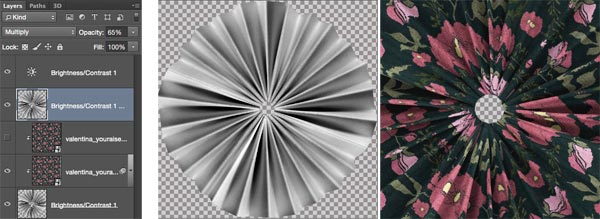

Figuring out the right amount to use for displacing a pattern is pretty much trial and error, but the higher the amount, the greater the distortion in the pattern itself. With higher amounts, you’re likely to see some tearing in the pattern, which may or may not work. Further, unless the pattern you choose is fairly well defined or has clear vertical or horizontal lines, you probably won’t see very much benefit from using a displacement map over simply clipping the pattern to the base image and using a blend mode to merge the two.


Creating flowers isn’t the only reason to use the Displace filter when creating elements for scrap and art journaling. Designers have long used displacement maps when they’ve wanted to add patterns to draped fabrics for illustration. Whether you’re creating clothes for art journal dolls, or curtains for a fantasy scene, as I did, the Displace filter will add a touch of realism, and can even work well with sheer fabrics. After using the method I’ve described, I still thought the fabric was a bit too dark, so I loaded the transparency for the curtain layer, added a new layer at the bottom, and filled it with white—since the selection held transparency, the fabric remained sheer, only a bit less so. And since I wanted to show that the fabric is slightly sheer, I decided to show it against a background paper. Of course, at that point I couldn’t quit. . .


